February 11, 2019 - Comments Off on Microcopy — Making Interfaces Human.
Microcopy — Making Interfaces Human.
Design is still about words. There was a post by Signal V. Noise a while ago that reiterated this with visual reminders: interfaces stripped right down to their boxes, images and colors, no copy on the page. This really drove home the point. What are interfaces without the words?
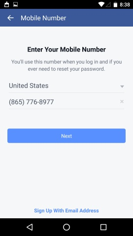
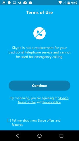
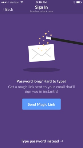
Now, there are words that are obviously important and hard to miss (Save, Continue, Sign up). And then there are words that are powerful yet tiny and simple (We’ll never post on your wall. We’ll never ask for your credit card information. Don’t worry, you can change this username later).
Microcopy is what makes any app or interface human, friendly and helpful like no other feature.
Every user is talking to herself in her head, as she uses an application or a product. Actually, she is talking to the interface:
“How long will this take?”
“Why are you asking me this?”
“Will you charge me for this?”
“Oh no! What’s wrong?”
“How do I go back to where I was?”
“What now?”
Crisp and unmistakable copy that guides her in the right direction, while also assuring her that it’s all going to be alright, and also making her smile from time to time, without talking down to her. That is what makes great microcopy.
Clarity
Words that can be misinterpreted or are unclear can make for a confusing and frustrating experience. The user must be able to answer those questions in her head without entering panic mode.
Helpfulness
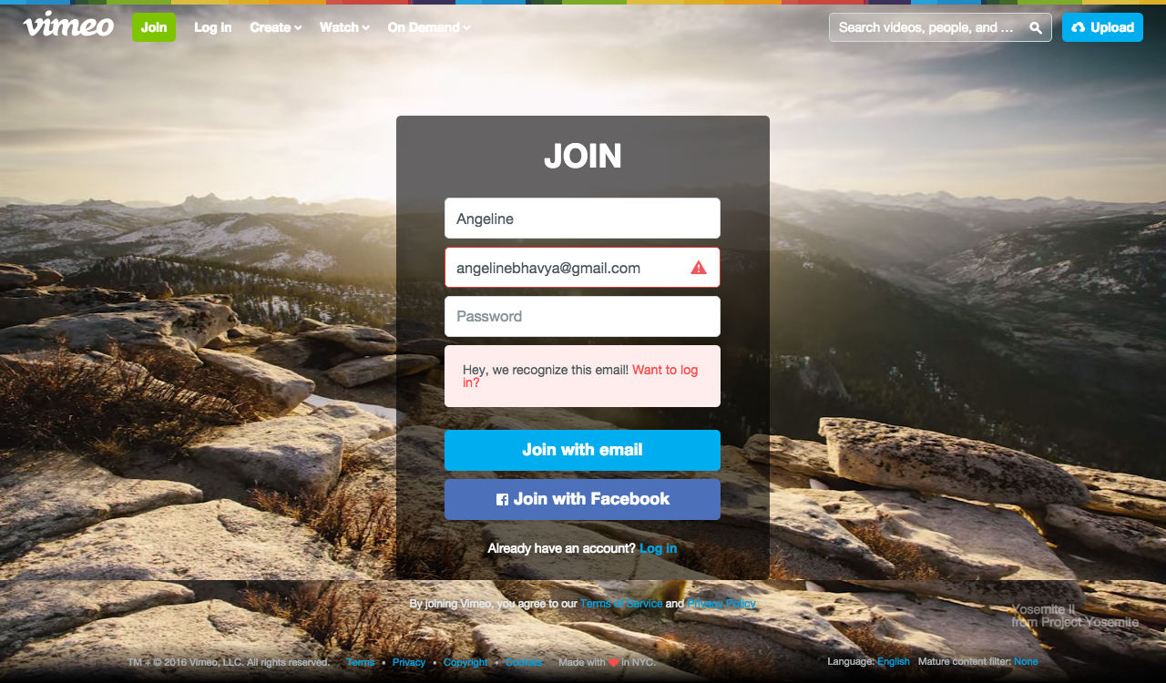
Timely help is always a huge relief. Especially when there are multiple tasks ahead of a user. If a form field label asks for something that the user is not sure about, some helpful copy can be a game changer.


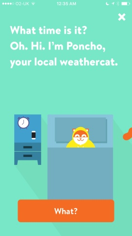
Personality & Tone
Nothing makes the user look at a brand as a human like a quirky and cheery personality. Of course, timing and moderation are crucial in creating these delightful moments without leaving an unpleasant aftertaste.

Empathy
Who doesn’t want an app or a product to just ‘get’ them? Reflecting how the user is feeling and responding appropriately can make the world of a difference to the experience. Mailchimp puts it very well in its amazing resource voiceandtone.com:
Before you write for MailChimp, it’s important to think about our readers. Though our voice doesn’t change much, our tone adapts to our users’ feelings.
Whether it is online or offline, we have all seen confusing notices/error messages, misleading signage/navigation text, and the deafening silence of no information when you haven’t a clue what to do next. In the physical world, body language, voice and facial expressions fill up the gaping break in communication. When it comes to interfaces, it’s the tiny words that speak louder.
Comments are closed.