

Designing for Enterprise - Cleaning up the messy desk
A few months ago, we found ourselves in the office of a Fortune 500 company that builds enterprise software for a whole variety of client companies. The mission: To Redesign their Flagship Product. A daunting assignment for a UX team of two. We initially pitched for the deal with a taste of the redesign: taking just a couple of user flows and putting some visual and UX standards in place, to come up with redesigned screens for those flows. Having found our work promising, they decided to bring us in to take on the whole thing. This is an account of how we went about it and what we learnt through it all.
Understanding the product
Enterprise usually involves complex flows and vast feature sets. We took our time to learn and understand the primary tasks and other not-so-frequently run tasks. This meant going through several demos and question-answer rounds with product experts and users. The product is usually used by a very small team in an organisation, who are experts in the system. The impact of any change made to the system would make a big difference to every user. Considering users are very comfortable with the current system, we could expect a resistance to the proposed changes.
Setting goals
As we went about analyzing the product, we also needed to ensure our goals were clearly set for this project. We proceeded with the following three main goals for our assignment:
- Usability: Reduce the support on the client’s side to guide their small business customers.
- The user must be able to achieve his end goal in few clicks. Reduce repetition of screens.
- Styling: Restyle the UI to look sleek and modern.
Making sense of a complex system
To wrap our heads around the vast system, we put down every part of it in front of us in the form of post-its on a wall. This helped us look at the whole system in one glance and also see obvious relationships between sub-parts and notice repetitions that could be avoided, and features that could be clubbed logically.
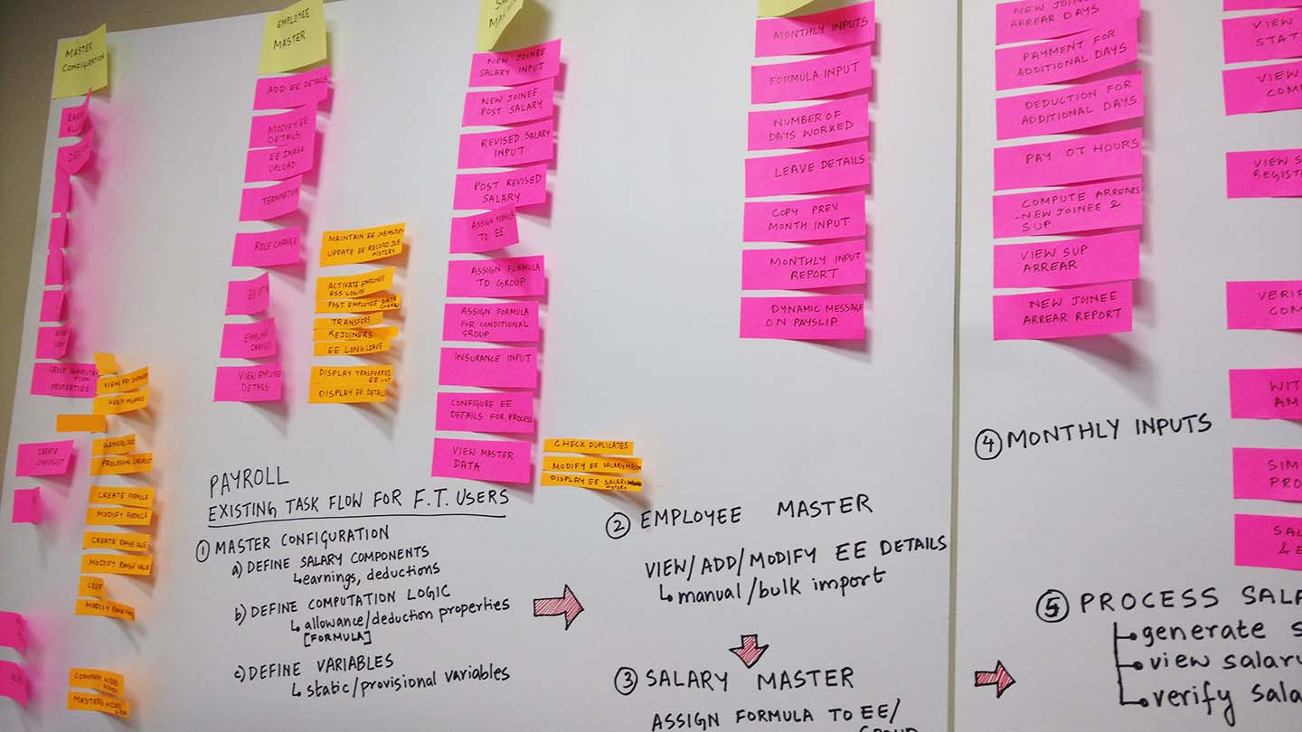
After a couple of weeks of studying at the system in this way, we re-arranged it into a redesigned information architecture. Visually, we could see that the system was already simplified, as we had taken care of the architecture at both a high level and at module level.
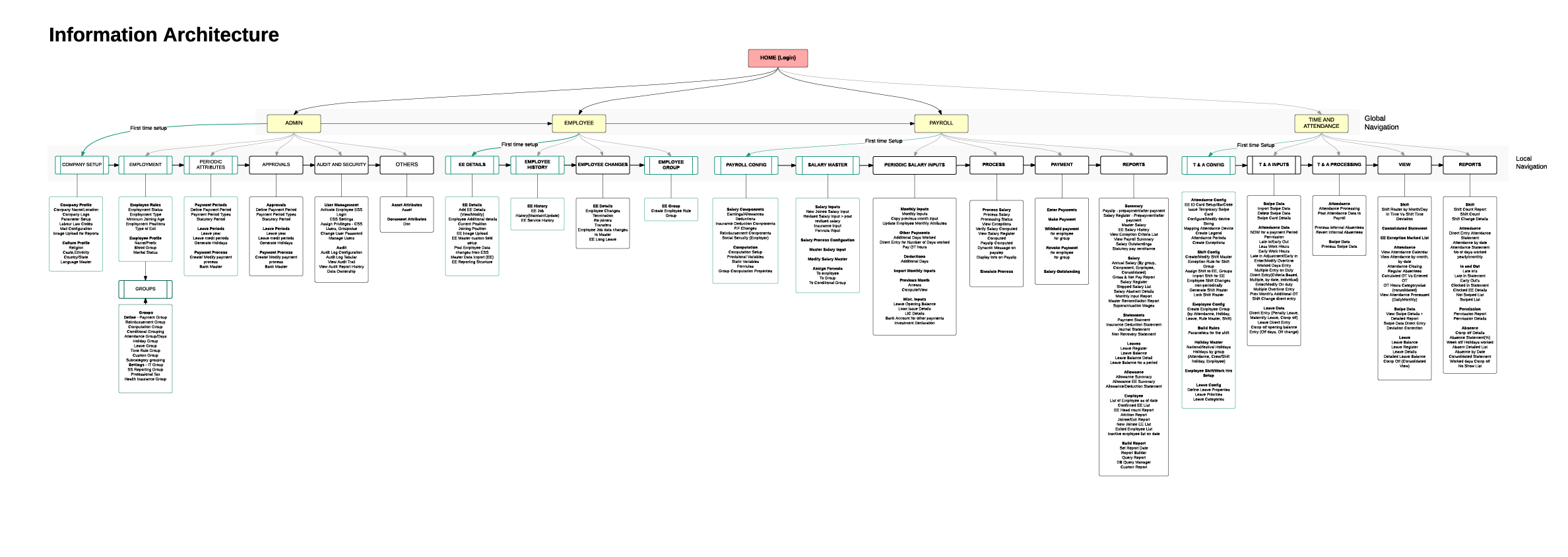
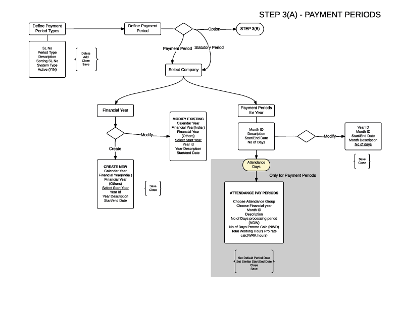
Next, we proceeded to run through major tasks within each module to see how it would play out in context of this new information architecture. Looking at it in this way helped us to re-arrange and refine the architecture based on user tasks and goals. The tasks were further detailed in the form of task flow diagrams, which helped us communicate our understanding with the client, as well made the flow clearer to us when we took it forward from here to wireframe phase.
On to wireframes
The foundation now set, we looked at the UI of the product in view of the IA and the task flow diagrams. We sketched options for wireframes and discussed their pros and cons, till we arrived at a few that would work. We formalized these wireframes for a module at a time, translating our task flow diagrams to wireframes. We found this translation easy because of the homework done in terms of understanding the details of each task.
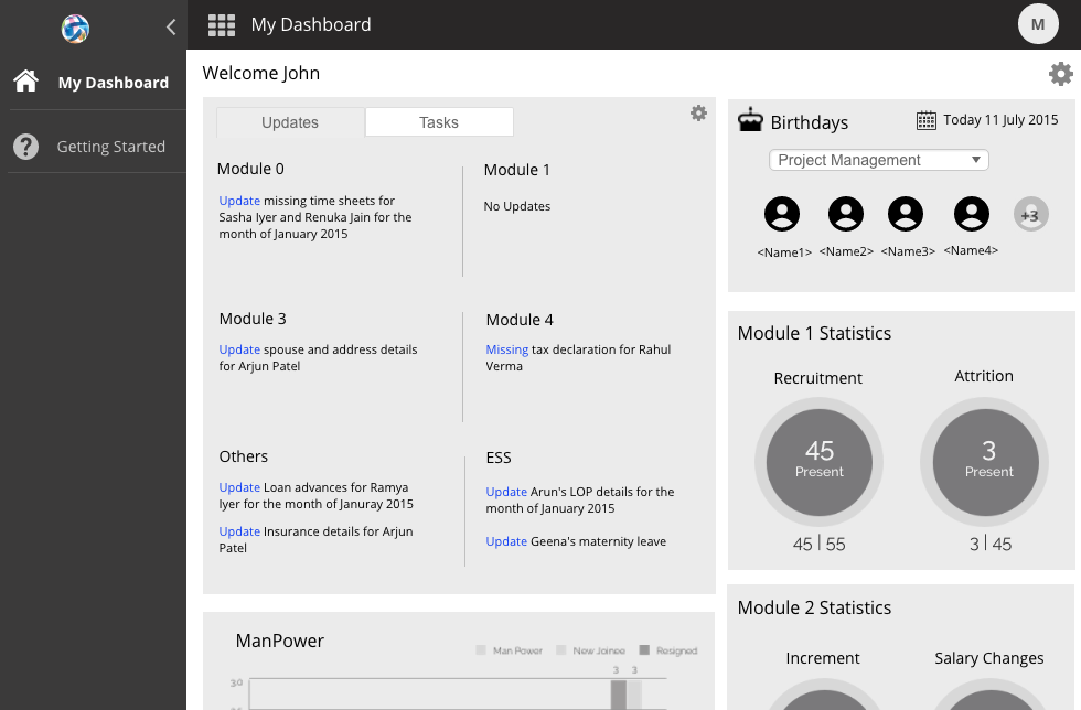
Our digital wireframes were crafted on UXPin after considering other options such as Invision, Marvel, Axure etc. We wanted a tool that could both be used for wireframing as well as prototyping, while being collaborative. UXPin proved to be a good choice.
As we churned out wireframes for each module, we set up demos with the client to go over the wireframes and get feedback which could be used to re-iterate on the wireframes.
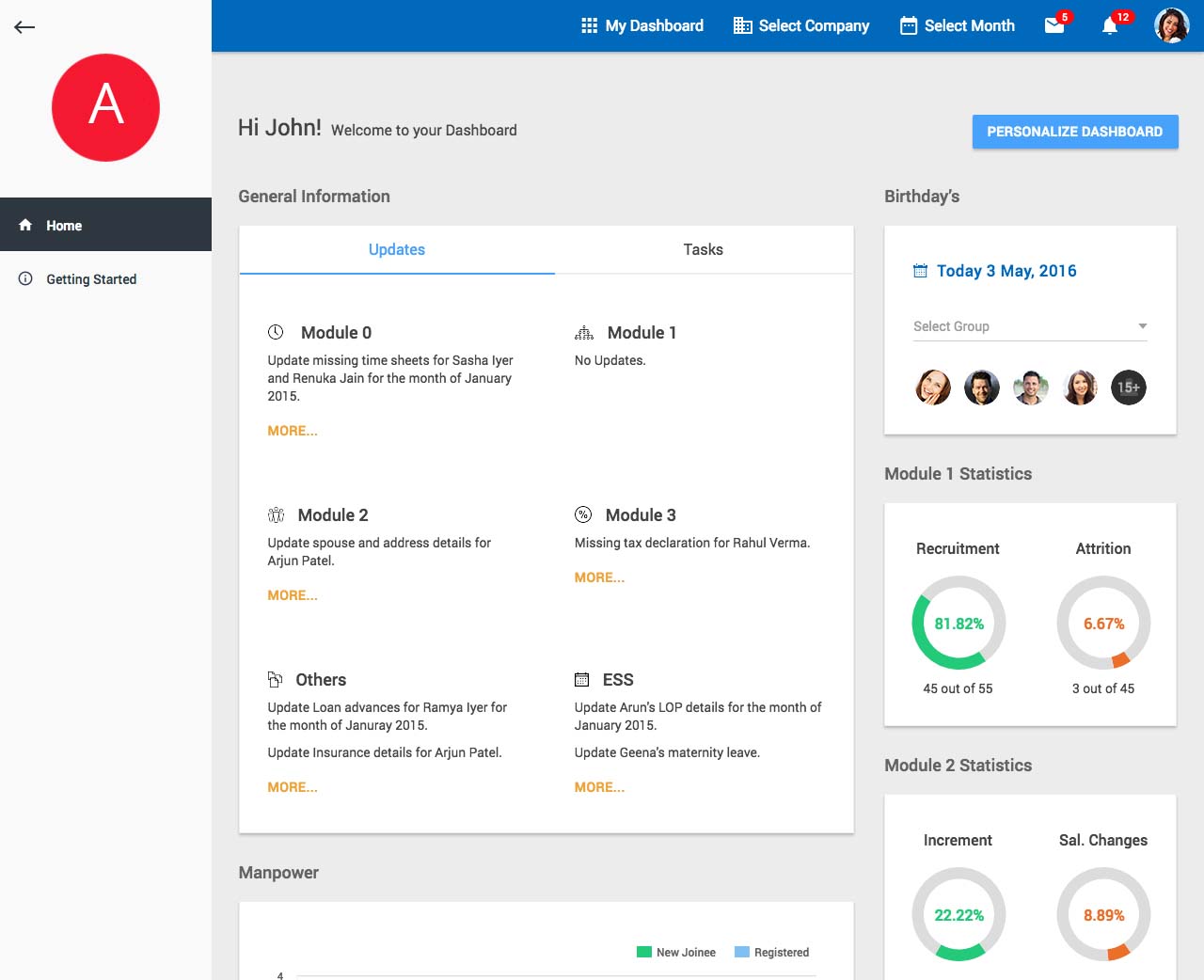
Visual styling & HTML
At the same time, we also gave thought to the visual styling of the product. This was a huge part of the standardization of the UI, as the current product had many different styles for the same components, which led to confusing and hard to maintain UI. We worked on a UI style guide which could be used across the system to redesign all the page types in the products. This same standardization was taken forward to HTML along with help documents which could be used to rebuild HTML from the ground up.
Challenges
During the course of the project, there were challenges as are expected in any design engagement. Apart from time crunches and pushbacks from the client, the most important challenge was keeping a constant and effective communication with the client. A large part of our communication with the client was about clearly depicting the role of design in accomplishing the goals of the project. This involved explaining and demonstrating how every stage of the design process – research, information architecture, task flows, wireframes and visual design – each play an important part in crafting the behaviour of the product in a way that serves both user and business needs.
This project proved to be a rich learning experience in finding our way around an enterprise product, while also sharpening our client relationship skills and affirming how, whether clients or UI or users, design is always about people.
——–
Team:
UX: Angeline Bhavya, Sowmya Thiruvengadam
Visual Design: Sourav Mukherjee
HTML: Srikar Dhulipalla